
November 23, 2025
Checkout Optimization
Checkout optimization is the continuous practice of refining the final purchase stage on an e-commerce website. The primary objective is to make the entire checkout flow as simple and secure as possible for all users. This critical process works to reduce friction for customers and helps to significantly increase completed sales.
Drishti, Manager - Digital Marketing
Table of Contents
- What is Checkout Optimization and Why Is It Important?
- What Are the Top Reasons That Your Customers Don’t Convert During Checkout?
- 10 Checkout Optimization Strategies to Boost Conversions
- Make Your Checkout a Conversion Machine
- Conclusion
Checkout Optimization
Checkout optimization is the process of systematically improving an e-commerce platform’s checkout flow to make it quick and Seamless for customers. The ultimate goal is to remove any friction or doubts that could stop a customer from completing their purchase. This requires simplification of the checkout steps for building trust at the final hurdle.
This process is critical because a difficult checkout experience directly results in a significant amount of lost revenue. If your checkout process is slow or confusing, potential customers will almost certainly abandon their carts. High cart abandonment rates represent a major leak in the sales funnel that optimization can fix.
The average cart abandonment rate hovers near 70%, which is a painful figure for most online retailers. This statistic shows that seven 7 of 10 potential customers are walking away at the final step. Effective checkout optimization directly addresses this costly problem and helps to recover those lost sales.
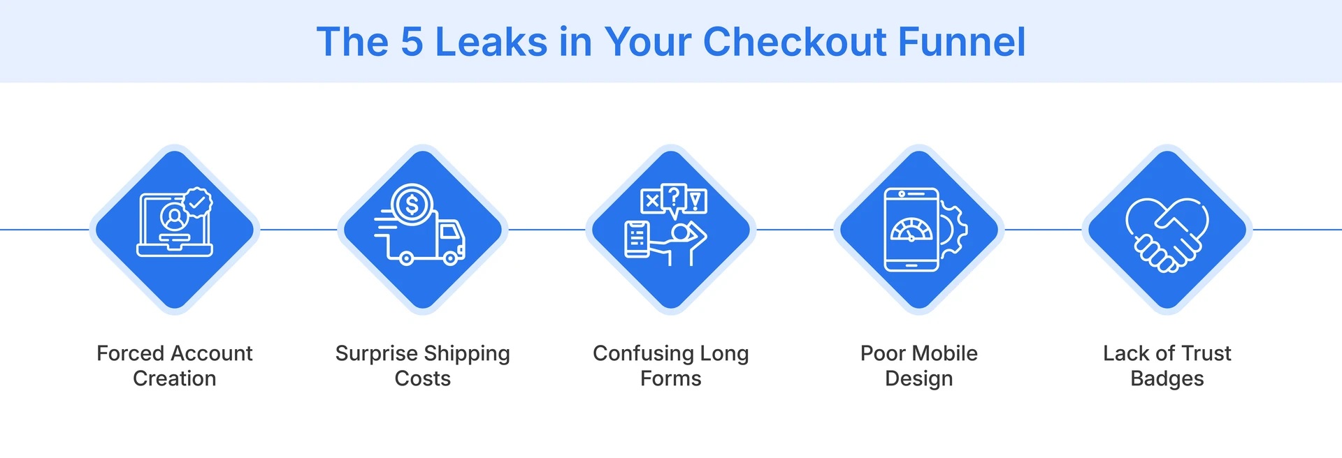
What Are the Top Reasons That Your Customers Don’t Convert During Checkout?
Many frustrating factors can halt a customer's purchase at the last possible moment. Understanding these common barriers is the first step to optimizing your checkout flow and improving conversions.
-
Forcing Account Creation: Many shoppers will not create a mandatory account just to buy one or two items. This demand adds unnecessary time and friction to the process, feeling like a significant barrier to a simple purchase.
-
Complicated Steps: A checkout process that involves too many steps or confusing pages will feel overwhelming to users. Customers today expect a quick and straightforward experience, not one that feels like a long, drawn-out task.
-
Mobile Hostility: A checkout page that is not properly designed for mobile devices is a major conversion killer. Users will get frustrated trying to pinch and zoom on small screens, making data entry nearly impossible.
-
Shady Security: Customers are extremely cautious about their online payment security and personal data. A lack of visible trust signals like SSL certificates or security badges makes shoppers feel nervous and unprotected.
-
Payment Roadblocks: Failing to offer a customer's preferred or expected payment method is a very simple way to lose a sale. Shoppers now expect variety, including digital wallets and ‘Buy Now, Pay Later’ services, not just credit cards.
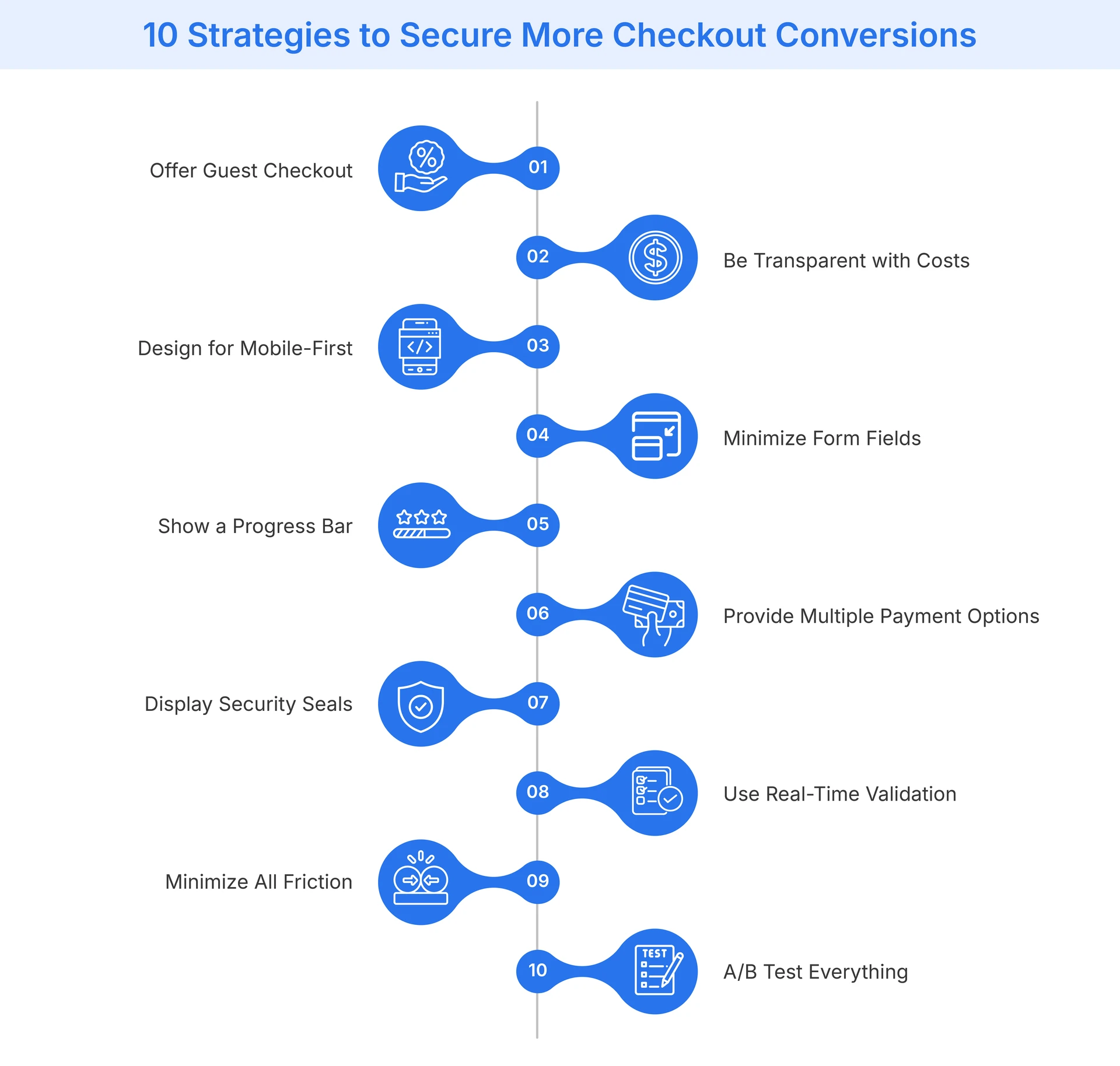
10 Checkout Optimization Strategies to Boost Conversions
You can implement several key strategies to fix common checkout issues and measurably increase your conversion rate.
Embrace the 'Guest Checkout'
You should always provide a clear option for customers to check out as a guest. This immediately removes the major barrier of forced account creation, which deters many shoppers. You can still offer an option to create an account after the purchase is complete, capturing their information without risking the initial sale.
Be Transparent with Costs
Surprise costs are consistently the number one reason for cart abandonment. You must display all charges, including shipping fees and taxes, as early in the process as possible. This transparency builds crucial trust and prevents the ‘sticker shock’ that causes customers to leave the page right before paying.
Design for Mobile-First Optimization
Your checkout page must work flawlessly and intuitively on all mobile devices. This requires using a responsive design with large buttons and easily tappable form fields. A mobile-first approach ensures you are not alienating the majority of your shoppers who browse and buy on their phones.
Minimize Form Fields and 'Mental Load'
Only ask for the information that is essential to complete the order. Every extra field you ask a customer to fill out increases friction and the ‘mental load.’ Use modern features like address auto-complete to speed up the process and make it feel effortless for the user.
Show Them the Finish Line
You should use a visual progress bar to show customers exactly where they are in the checkout process. This simple indicator manages expectations and reduces any anxiety about the process's length. Knowing they are on ‘Step 2 of 3’ makes the process feel finite and encourages them to complete the final steps.
Offer Multiple Options for Payments
Offer a diverse range of payment methods to cater to the preferences of all customers. This must include major credit cards and popular digital wallets, such as Apple Pay or Google Pay. The more convenient you make the payment, the less likely a customer is to abandon their cart due to a missing option.
Flaunt Your Security
Visibly display your trust signals and security badges throughout the entire checkout process. SSL certificates and ‘Secure Payment’ notices reassure anxious customers about their data. This visual confirmation that their financial information is protected is crucial for building the confidence needed to complete the purchase.
Use Real-Time Form Validation
Prevent customer frustration by validating form fields as they are being typed. Instantly alert users to a formatting error in an email address or a missed required field. This is much better than showing an error page after they hit submit, as it makes the correction process smoother.
Minimize Friction as Much as Possible
Review every single element on your checkout page and question its purpose. You should remove any distracting banners or unnecessary navigation links. The checkout page must have one single goal: completing the purchase. Eliminate any element that could pull the customer away from that final action.
A/B Test Everything
You should not assume you know what works best for your specific audience. Continuously test different versions of your checkout page to gather actionable data. Test your button colors, the call-to-action text, the number of form fields, or the overall page layout to find what truly improves conversions.
Make Your Checkout a Conversion Machine
A streamlined checkout is the most effective sales tool for converting interested shoppers, as this final step should always be the easiest. Applying these crucial checkout optimization strategies is what transforms a leaky sales funnel into a conversion-focused machine. This process changes the checkout from a barrier into a seamless brand experience that builds customer trust.
Flipkart Commerce Cloud offers robust and reliable solutions, engineered to power this entire experience at scale. Its systems are proven to handle massive traffic, ensuring high availability and resilience even during peak sales events. This battle-tested technology offers a fast and secure process that modern customers expect from all online retailers.
The advanced Cart and Checkout services from FCC are specifically designed for maximum conversion. The platform offers robust features, including intelligent address validation and dynamic one-click payment integrations. These solutions provide retailers with the tools to reduce friction and build a trustworthy experience that turns shoppers into loyal customers.
Conclusion
Checkout optimization is not a one-time task, but rather an ongoing process of refinement and testing. Customer expectations are always evolving, so it's essential to continuously monitor your checkout performance to identify new points of friction.
By committing to this critical process, you can significantly reduce your cart abandonment rates. This directly increases your company's revenue and enhances a much better customer experience, benefiting both you and your shoppers.

FAQ
The most common reason for abandonment is unexpected costs found during checkout. High shipping fees or taxes that were not revealed earlier are the primary cause. This "sticker shock" breaks the customer's trust and causes them to abandon their purchase, even if they were ready to buy.
Both checkout styles have distinct advantages that can work for different businesses. A one-page checkout can feel faster, while a multi-step checkout with a progress bar feels less overwhelming. The best choice depends on your audience, so you should A/B test both to see what performs best.
You can make the process faster by minimizing the number of form fields. Only ask for the information that is essential for the order. Implement features like guest checkout to allow users to skip account creation. Using address autocomplete and offering express payments, such as Apple Pay, also saves valuable time.
Display security badges, such as SSL certificates and "Secure Payment" logos, in visible locations. Be completely transparent about all costs upfront to avoid any last-minute surprises. You can also include customer support links or a phone number. These elements reassure shoppers that your site is legitimate and safe.
You should implement a cart abandonment email campaign to recover lost sales. These automated emails gently remind customers what they left behind in their cart. You can include an offer or a simple link back to their cart. This strategy gives you a second chance to convert the shopper.